
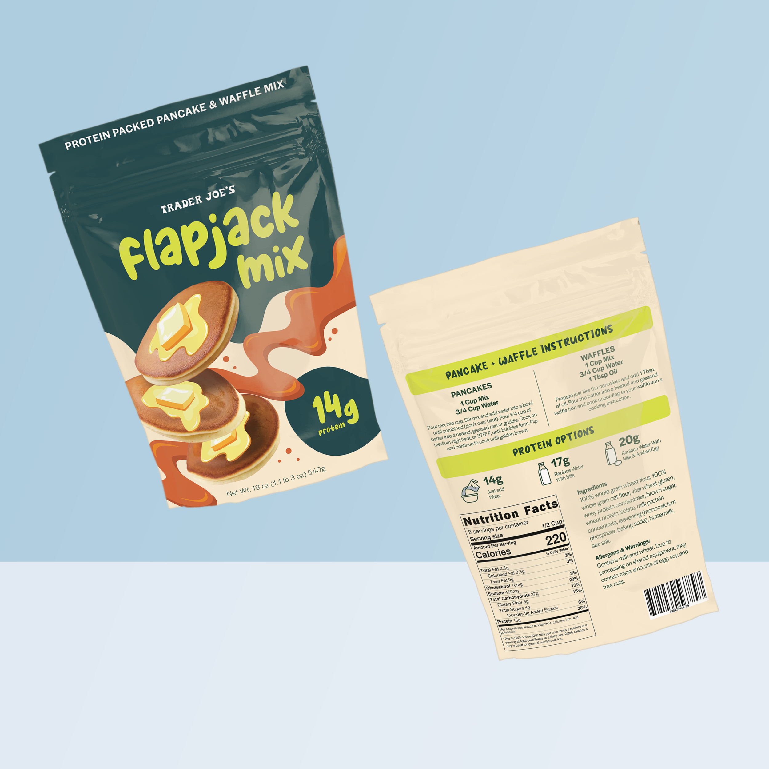
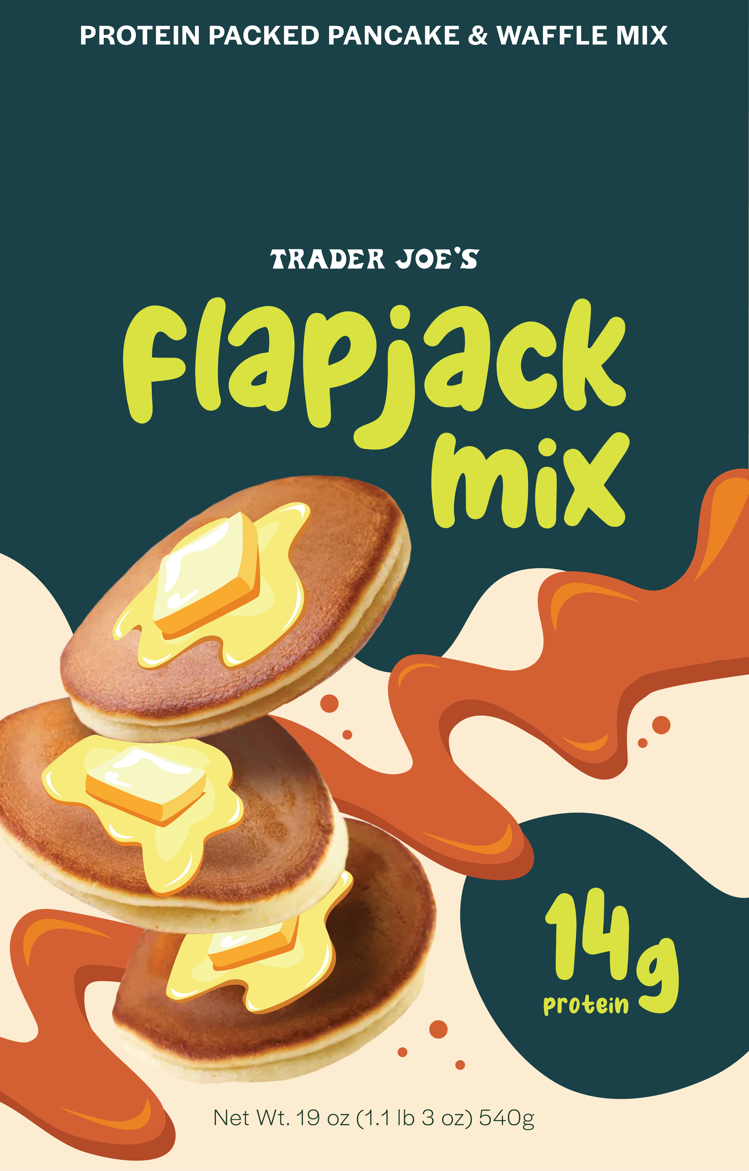
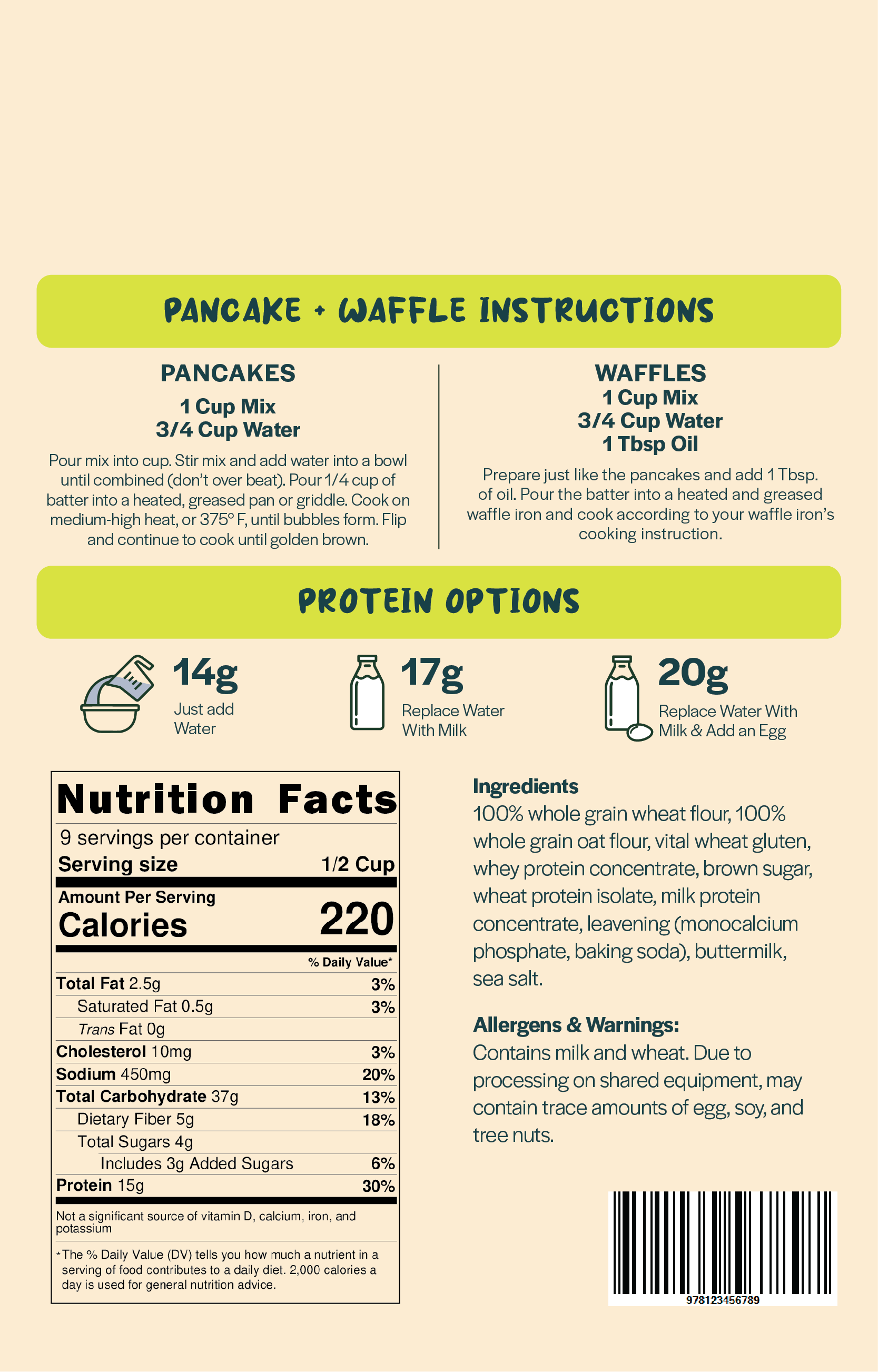
Trader Joe’s Flapjack Mix
For Trader Joe’s, I conceptualized and designed the packaging for a protein-packed pancake & waffle mix. The company’s packaging often features light hearted, witty elements. This approach adds a playful feel to their brand - not to mention the use of bright, bold fonts and colors that are a hallmark of their packaging.
Target Audience: Men and women aged 18-35, disposable income, maintain an active lifestyle, enjoy nature and outdoors.
Color Palette: Energetic colors that relate to nature. Earth tones with pops of vibrant colors.
Typography: Bold, rounded, groovy, modern.
Imagery: Food photography that capture intricate details and nuances of the food that illustrations might miss. Modern consumers are accustomed to seeing high-quality food photography in advertisements, menus, and social media. Using photography meets these expectations and aligns with current marketing trends. Trader Joe’s often incorporates illustrations to their packaging - so elements such as syrup and butter are hand-made illustrations traced into vector designs.

color palette
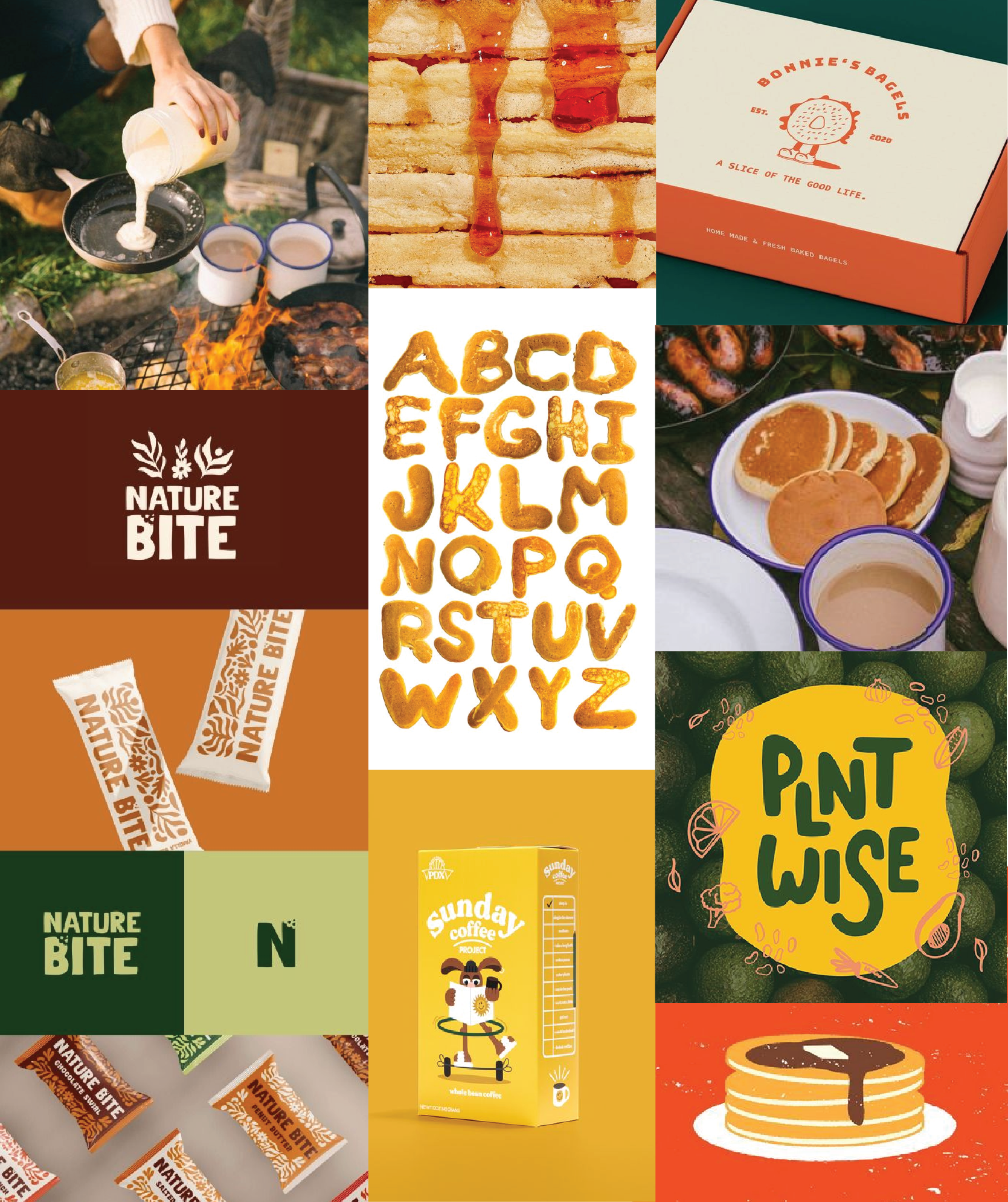
moodboard
fonts